RedCap Digital Media

Branding
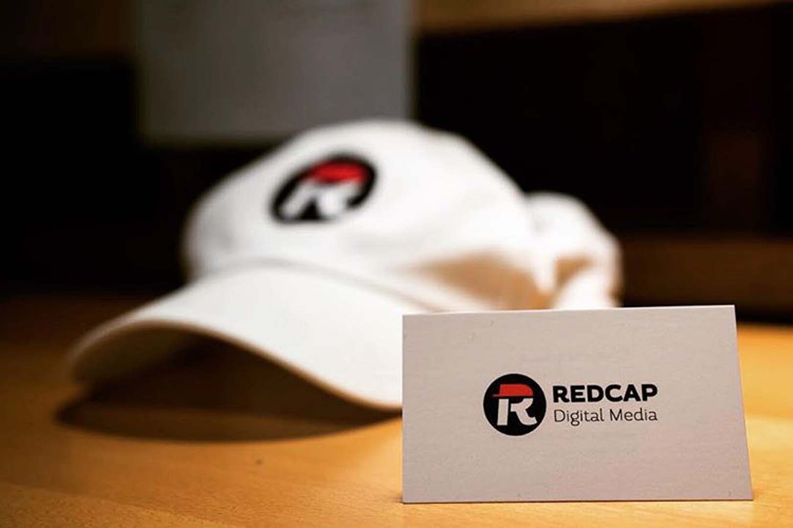
Going in, I knew I wanted RedCap's branding to be simple but communicative. The logo is the result of a 2-day marathon design process with over 20 prototypes. It was important to me that the logo be recognizable both in full color and as a single color glyph and I think I achieved that.
Central to the brand is a feeling of cleanliness and minimalism. Wherever possible, the logo is on a white background uncluttered by other text. This lends an air of modern professionalism to the branding that greatly benefits the company's overall perception.
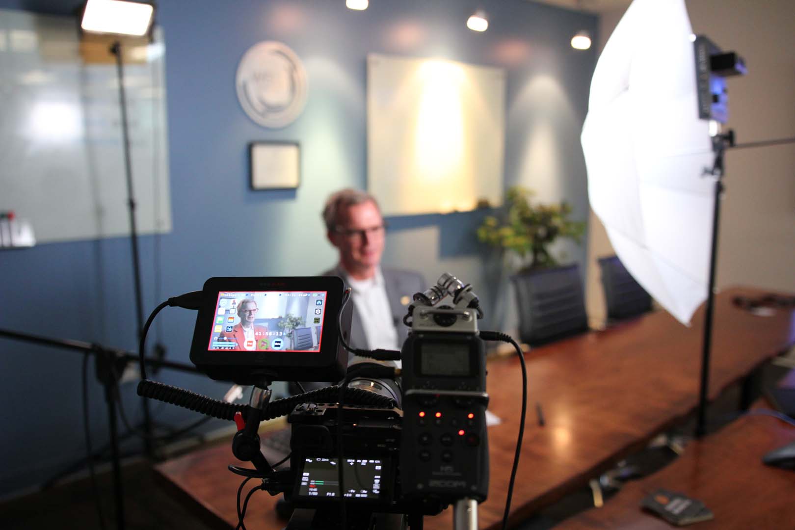
Markon Solutions Shoot
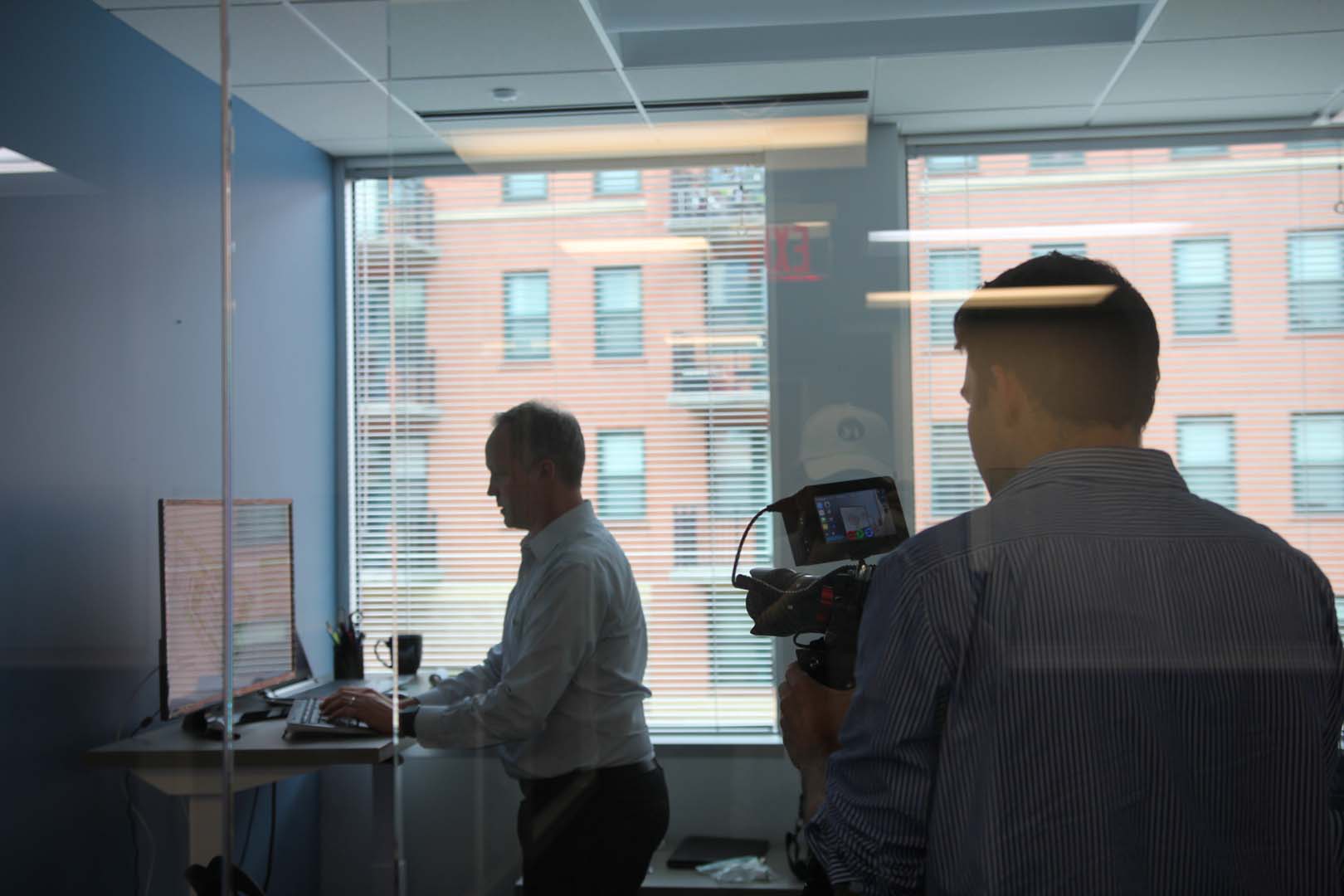
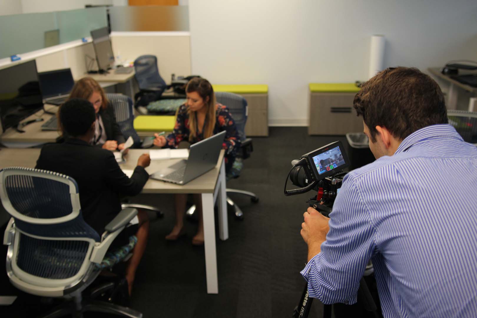
Markon Solutions needed a video to promote their Facilities Solution so we worked with them to develop a concept and execute it. We shot at their Falls Church office as well as onsite at one of their construction projects. The final video was engaging and polished, showcasing their capabilities in the Facilities arena without being too complex or too simplistic.


Copyright © 2024 Chris Markus